Inspectra
Figma
Project
A full multi-page SaaS website design for a synthetic data analytics platform — clean, professional, and built to communicate complex capability with clarity and confidence.

A powerful platform that needed a face
Inspectra is a B2B SaaS product built for engineers, analysts, and AI teams working with synthetic data. The technology was sophisticated — but the visual language wasn't communicating that sophistication to the right audience.
The goal: design a complete multi-page website that positions Inspectra as a credible, enterprise-grade product — confident enough to compete with category leaders, clear enough that a first-time visitor immediately understands the value.
Pages designed end-to-end
Home, Product, Pricing, and About Us — each with a distinct purpose and consistent visual system flowing through all of them.
Audience: engineers & analysts
A technical audience that distrusts fluff. Every section had to earn its place by communicating real capability, not just marketing language.
Clarity over decoration
The visual direction was chosen deliberately: a purple/indigo primary palette that reads as technical and trustworthy, paired with generous white space and tight, purposeful typography. No filler sections. No vague hero copy. Every screen had a conversion goal.
Component System
Built a reusable Figma component library first — nav, cards, pricing rows, feature toggles — so every page is consistent and fast to iterate.
✓ Scalable design systemConversion Architecture
Each page routes to a clear next step — free trial, pricing, demo request. The CTA hierarchy was planned before a single frame was drawn.
✓ Goal-led page flowData as Design
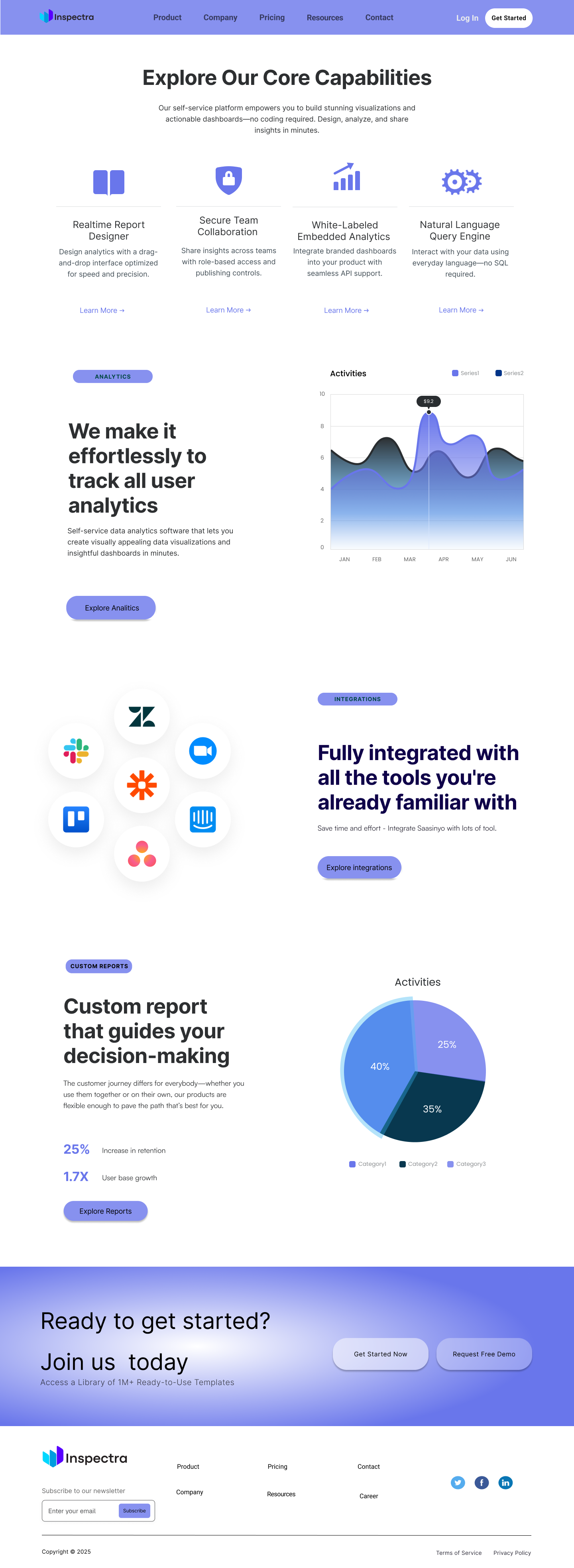
Dashboard mockups, charts, and stat blocks are used as hero visuals — showing the product in action rather than relying on abstract illustrations.
✓ Show, don't tellSix pages & Logo, one story
Each page was designed with a distinct job in the user journey. The Home page creates awareness and desire. Product builds understanding. Pricing removes friction. About Us builds trust. Together they form a complete acquisition funnel.
The navigation and footer were treated as a fifth design surface — keeping key links and a newsletter sign-up accessible from any point in the journey.
Details that do the work
Several decisions shaped how the final design came together — each one rooted in real UX reasoning rather than aesthetic preference alone.
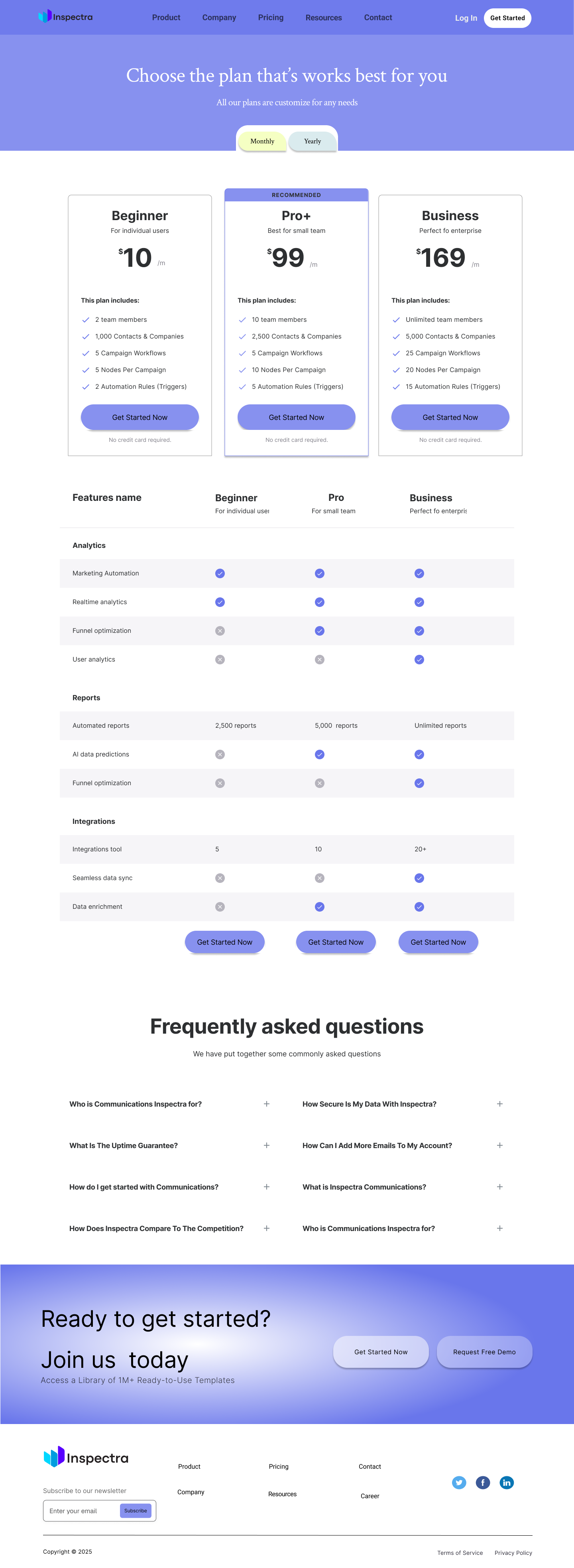
Pricing Toggle
Monthly/yearly toggle on the Pricing page with visual pill-switcher — reduces decision paralysis and communicates the savings incentive without a table row dedicated to it.
✓ Reduces frictionTeam-first About Page
Leading with named, photographed team members rather than abstract company values immediately humanises a technical product and builds the kind of trust that enterprise buyers need.
✓ Builds credibilityProduct Hero Mockup
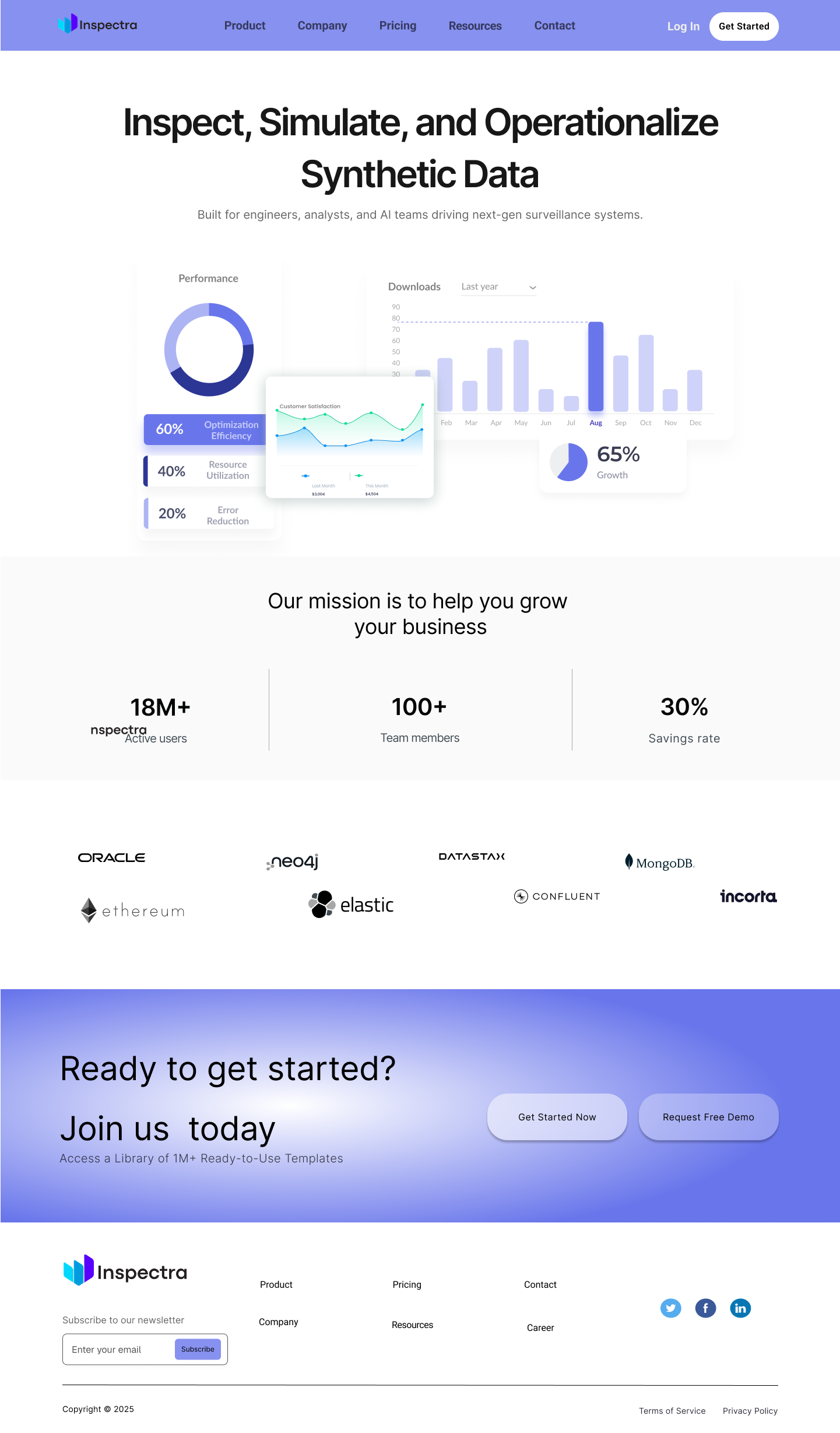
The Home page hero uses real dashboard widgets — donut charts, bar graphs, KPI cards — as the primary visual, giving prospects an immediate feel for the product before they read a word.
✓ Product-led storytellingA complete design system
What I learned
- Designing for a technical audience demands discipline — every word and visual has to earn its place. Vague benefits copy is immediately distrusted.
- Building the component library before designing individual pages cuts rework dramatically. Consistency becomes automatic rather than something to check.
- The Pricing page is one of the highest-stakes surfaces in any SaaS site. The recommended tier, the toggle, and the comparison table all need to work together to reduce drop-off.
- Using real product data visualisations in the hero section outperforms abstract illustration — it answers "what does this actually do?" before the user has to scroll.
- Design an interactive product demo or onboarding flow — reducing the gap between landing and first "aha" moment.
- Add a Resources / Blog page to support SEO and position Inspectra as a thought leader in synthetic data.
- Prototype the mobile experience — the dashboard-heavy hero needs a separate mobile treatment to remain readable at smaller sizes.
- Run usability testing on the Pricing page to validate whether three tiers is the right number, or if a two-tier model would reduce decision fatigue.
Get in Touch
Have a project in mind? I'd love to hear about it. Let's build something extraordinary together.
Book a free consultation